Skip to content
All work01 / 06

FeaturedBranding · UI/UX · Retail UX

Not Na Ice

A modern dessert brand experience spanning storefront direction, self-service kiosk UX, product visuals and customer signage.

Client
Not Na Ice
Role
Graphic Designer
Discipline
Brand · Retail · Product
Selected pieces
06 pieces
  • Not Na Ice wordmark in colourful graffiti lettering beside an illustrated strawberry milkshake overflowing its glass.
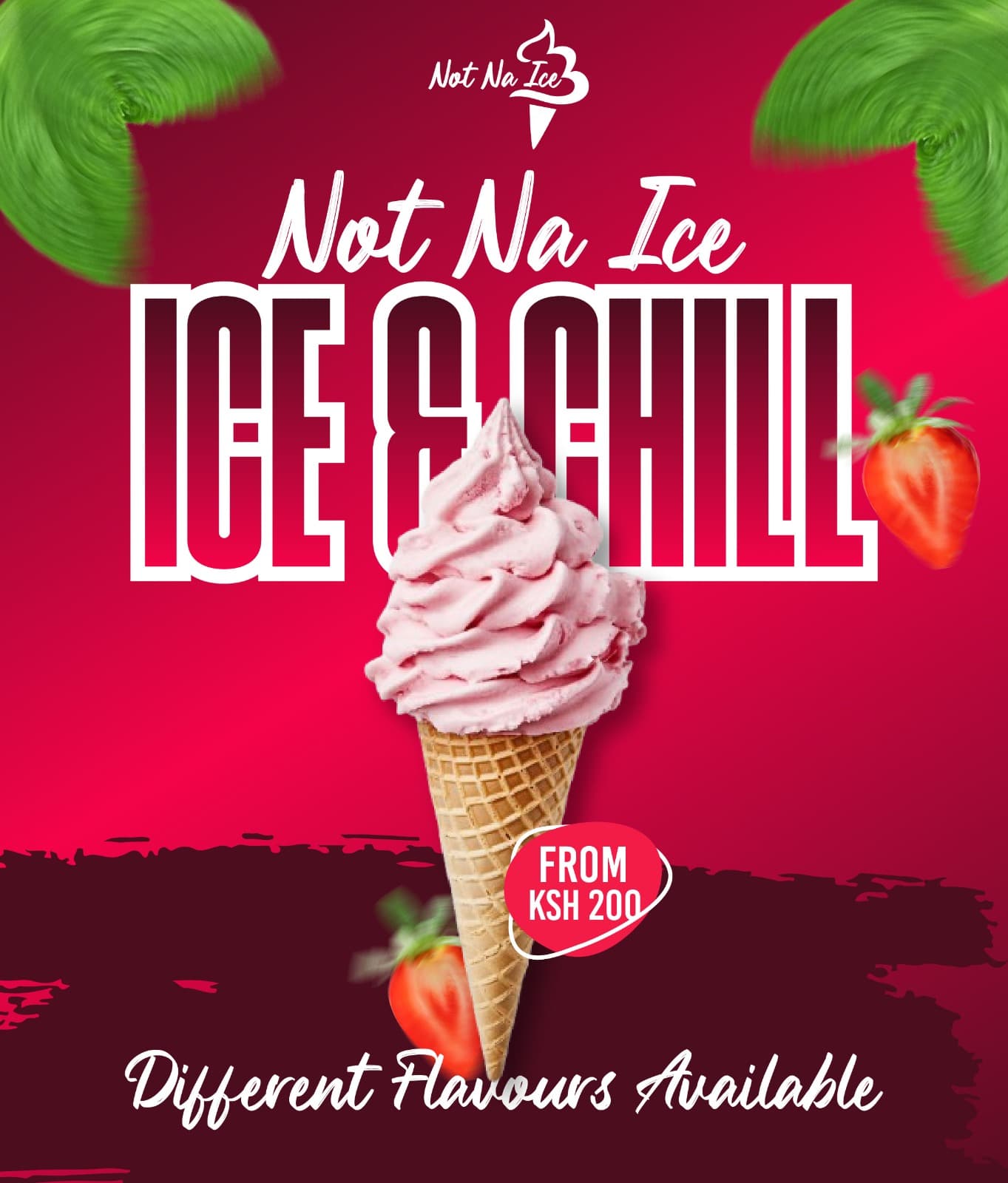
  • Poster of a strawberry soft-serve cone on a deep red background with the headline Ice & Chill and a From KSh 200 price badge.
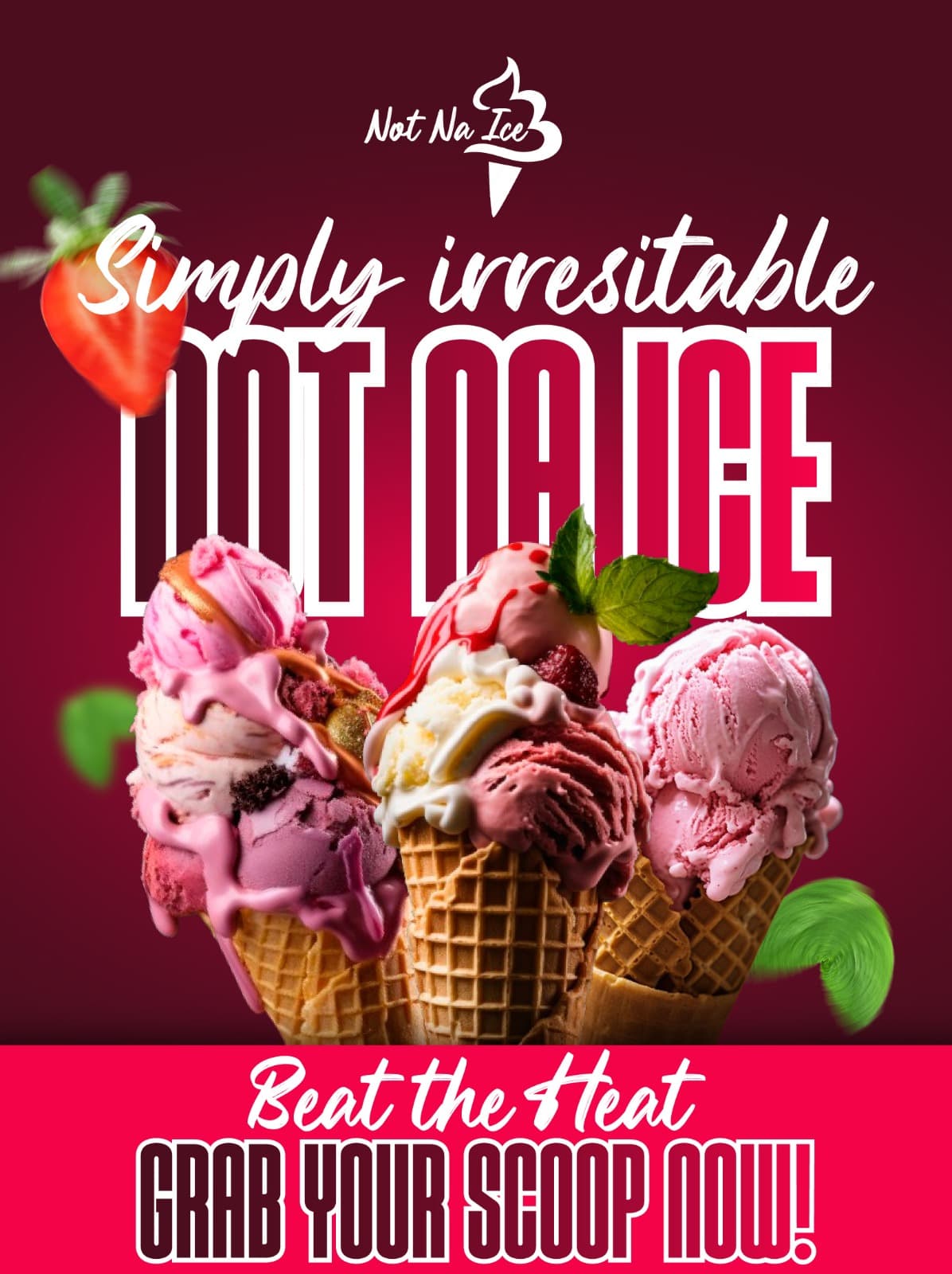
  • Poster of three loaded ice cream cones under the headline Simply irresistible, with a Beat the heat, grab your scoop now banner.
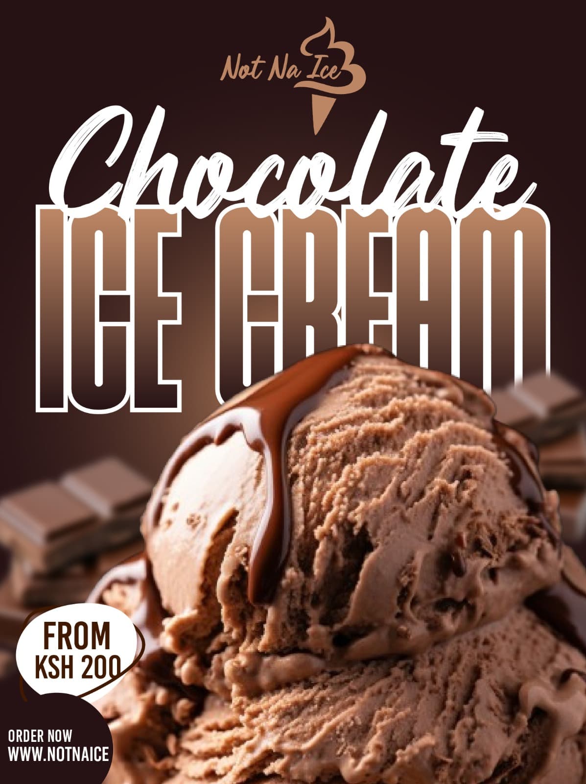
  • Close-up of chocolate ice cream with dripping sauce under a large Chocolate Ice Cream headline and a From KSh 200 badge.
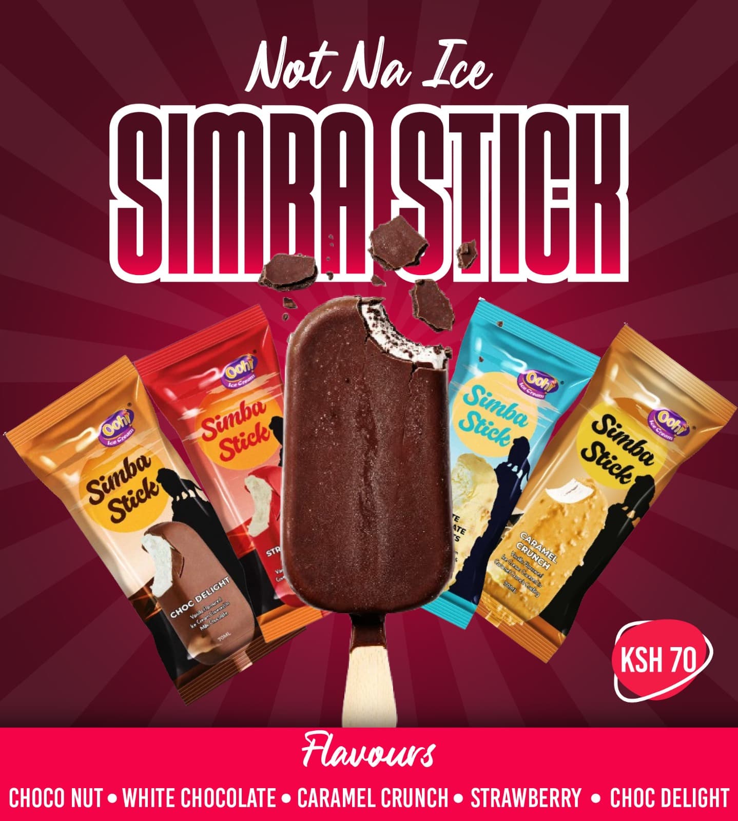
  • Product poster for the Simba Stick ice lolly showing five wrapped flavours fanned around a bitten chocolate stick, priced at KSh 70.
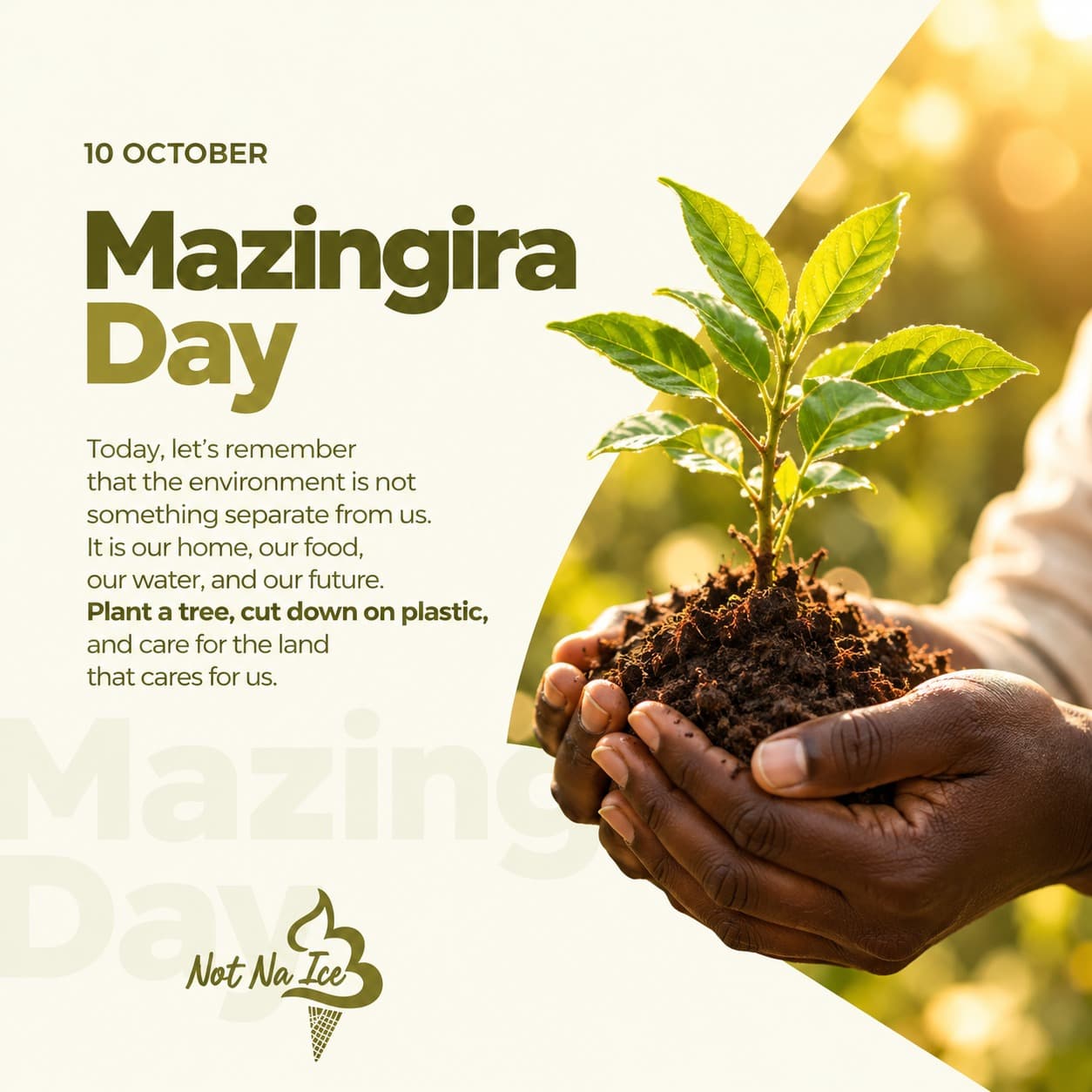
  • Mazingira Day post showing hands holding a seedling in soil, with a short message about caring for the environment and the Not Na Ice logo.
01 / 06Brand mark

01Overview

Not Na Ice is a dessert brand serving ice cream, milkshakes and yoghurt. I worked across the brand's customer touchpoints — from the storefront and the in-store ordering experience to the product visuals customers see online and at the counter.

The aim was a brand that feels playful and indulgent but is still easy to buy from: flavour-led visuals, prices that are impossible to miss, and an ordering flow customers can complete on their own.

Scope

  • 01Storefront direction
  • 02Self-service kiosk UX
  • 03Tablet interface
  • 04Product visuals
  • 05Customer signage

Offering

Ice creamMilkshakesYoghurt

02What I did

  1. 01

    Brand expression

    A graffiti-inspired wordmark and illustration style that gives the brand its loud, youthful personality and sets it apart from generic dessert shops.

  2. 02

    Product campaigns

    Flavour-led posters for soft serve, scoops, chocolate ice cream and the Simba Stick range — each built around the product, a clear price and a single call to action.

  3. 03

    Self-service kiosk & tablet UX

    Interface design for the in-store kiosk and tablet, structured so customers can find what they want and order without waiting at the counter.

  4. 04

    Storefront & signage

    Storefront direction and customer signage that carry the same colour, type and tone into the physical space.

  5. 05

    Social & seasonal content

    Calendar moments such as Mazingira Day that keep the brand present and relatable between product drops.

03Selected pieces06 pieces
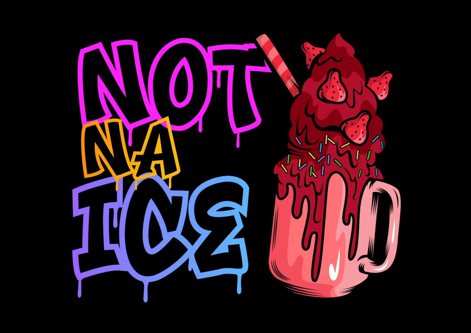
  • Not Na Ice wordmark in colourful graffiti lettering beside an illustrated strawberry milkshake overflowing its glass.
    01Brand mark
  • Poster of a strawberry soft-serve cone on a deep red background with the headline Ice & Chill and a From KSh 200 price badge.
    02Ice & Chill — soft serve
  • Poster of three loaded ice cream cones under the headline Simply irresistible, with a Beat the heat, grab your scoop now banner.
    03Simply irresistible — scoops
  • Close-up of chocolate ice cream with dripping sauce under a large Chocolate Ice Cream headline and a From KSh 200 badge.
    04Chocolate ice cream
  • Product poster for the Simba Stick ice lolly showing five wrapped flavours fanned around a bitten chocolate stick, priced at KSh 70.
    05Simba Stick range
  • Mazingira Day post showing hands holding a seedling in soil, with a short message about caring for the environment and the Not Na Ice logo.
    06Mazingira Day

Have a project in mind?

Let's make somethingworth remembering.

For branding, UI/UX, creative development or a digital experience with a strong visual point of view, let's talk.

Let's talk